ShopDreamUp AI ArtDreamUp
Deviation Actions


Suggested Deviants


Suggested Collections


You Might Like…


Featured in Groups

Description
Haha! Haha...HA!
....hells yeah...
Anyways!
Sorry for all the solar pics.
Wait no.
No sorry.
I can draw him if I wanna! YO!
I was testing out some new strategies and I'm more comfortable working with Solar so I used him.
Its that time again where I just need to improve!
°^° Imma getting bored of this same picture process I need something new...something MORE!
eh....*dies*....Imma steal your Photoshop CS Thomas. Imma steal it. Steal that baby and kill it with my stylus!
Image size
5826x4559px 8.86 MB
© 2014 - 2024 Rigiroony
Comments31
Join the community to add your comment. Already a deviant? Log In
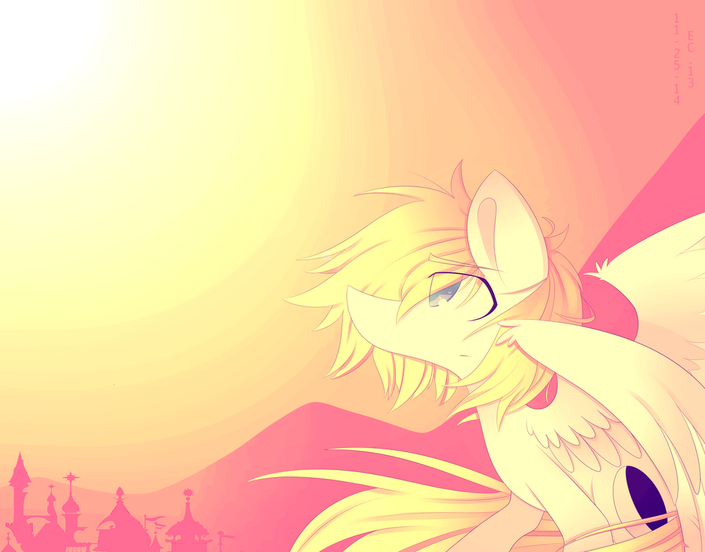
I love the monochromatic warm color scheme.
The composition is wonderful, theres nothing centered and there is enough stimuli around the page.
Your use of line work creates movement throughout the piece. I love the mountains in the background. Their ridge gives a positive movement leading up to the main focus adding an emphasis to the importance of the main focus.
I like how this are going off the page on all four sides, this is extremely important for a successful piece of art. I like how you used a cool color to distinguish the focus from the background so that they didn't fade into nonexistence.
I feel the purple dot under the wing is too distracting, because it is so contrasty to the surrounding warm color scheme it stand out a lot and literally gravitates all attention to it. It steals the spotlight from the image as a whole.
Also the date....this saddens me. Signatures, dates, and tittles are perfectly fine with art but only when its not on the piece. Write it on the back, put it in the description, make a hidden layer, save it on the file name, anything but putting it on the beautiful art. It's really unnecessary, distracting, and has nothing to do with the visual aspect of the piece.